Leaning Into Brand Work: Bougie Bites
This rebrand pushed me to think beyond a logo and build a full brand system. Here’s what I learned along the way.
One of the ways I’ve been pushing my creative skills recently is by leaning into real client work that forces me to think beyond individual assets. Instead of designing a single logo or graphic, I’ve been focusing on full brand systems. Work that holds together across platforms. Work that functions in the real world.
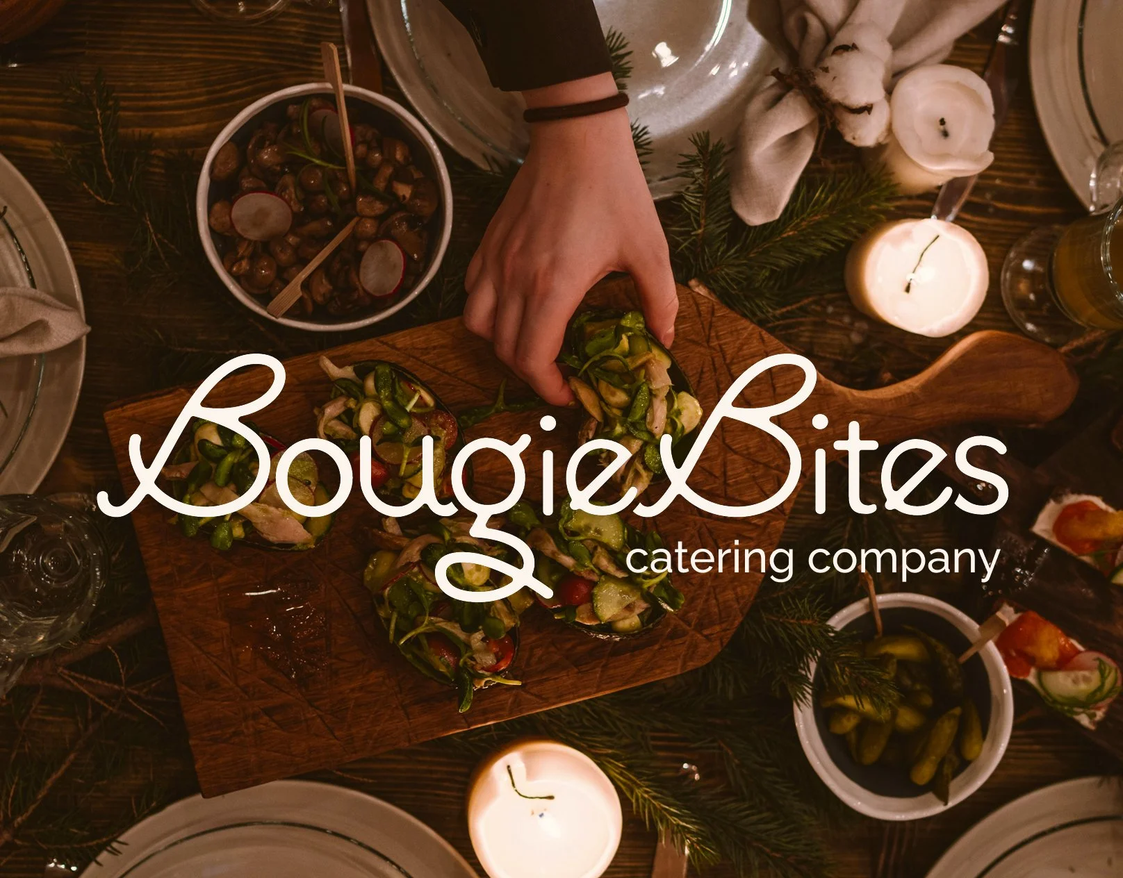
This project was a rebrand for Bougie Bites, a Florida-based catering company with a strong personality and regional identity. The goal was not to reinvent the brand entirely, but to refine and strengthen its visual language so it could be used consistently across digital, print, and event spaces.
For this rebrand, I developed a cohesive visual foundation that included logo design and submark variations, a refined color palette, thoughtful typography selection, and visual applications across multiple brand touchpoints. Every element needed to feel aligned while remaining flexible enough to grow with the company.
The challenge was clarity and cohesion. Catering brands live in many environments. They show up on menus, packaging, websites, social graphics, signage, and event materials. The identity had to feel polished in a digital mockup and equally strong printed at scale. It needed to feel recognizable without being rigid.
A large part of the process involved stepping back and asking questions. Does this color palette feel elevated and regional without leaning into cliché? Do the typography choices communicate sophistication while remaining approachable? Does the system work just as well in a single-color application as it does in a full brand spread?
I am definitely new to graphic design, and there is still a lot for me to learn. Building a full brand system challenged me in ways I expected and in ways I did not. There were moments of doubt, revisions, and rethinking decisions from the ground up. But for my first full brand design project, I can honestly say I am proud of myself for sticking it through.
In hindsight, this project took longer than I originally planned. But I am glad I allowed time to refine it. Brand systems require iteration. They need space to breathe and be tested in different contexts. Rushing would have compromised the cohesion.
The client was very happy with the final result, which is always rewarding. But what I value most about this project is how it pushed me to think structurally. Designing for longevity instead of novelty. Designing for use instead of presentation.
I would genuinely love to hear other designers’ thoughts on building brand systems. What do you think about this re-design? How do you balance flexibility and consistency?
Love to hear your thoughts!